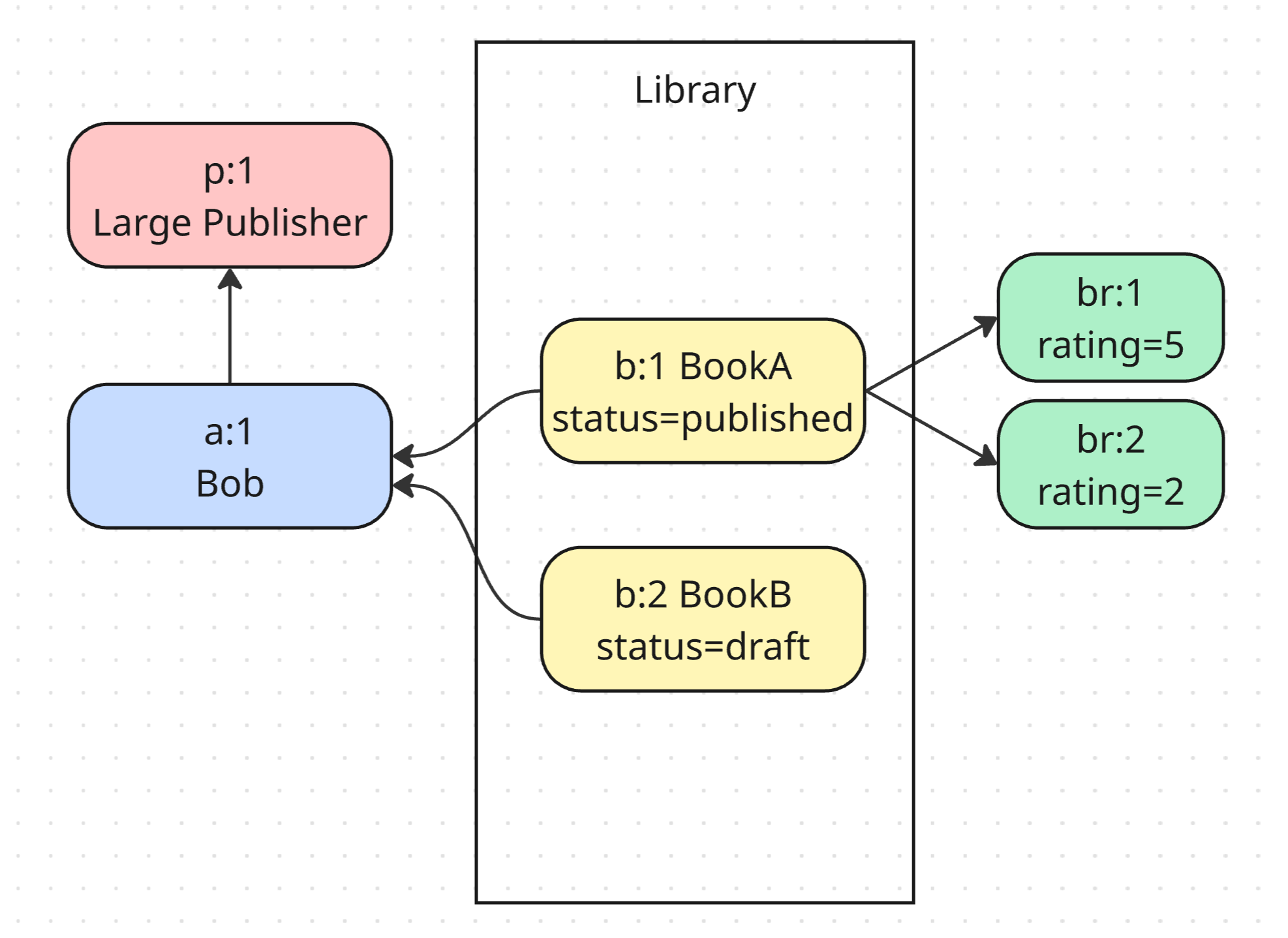
I’ve been using a diagramming style for a few years now, that I’d taken to calling “instance diagrams”, that look like this:
On a whim, I pasted one into Claude, and it turns out they’re called Property Graph Diagrams, and are popular in the neo4j/graph database communities.
The basic idea is to focus on “the rows in the database”, although not at a raw “literally every column & every row” sort of way, but more of an abbreviated “overview” of each entity:
- Each box/node is a row/entity in the database
- Each node has its id, which since we’re using Joist 🎉 is a tagged id
- The arrows are foreign keys, representing relationships between entities
- Only include the relationships/FKs we’re focused on—being exhaustive would actually hurt the readability of the diagram
- You can optionally color nodes by entity type
- You can optionally group nodes in boxes by whatever makes sense
The goal is to guide discussions & brainstorming through scenarios, i.e. for some specific scenario (or small set of scenarios), how do the “rows in the database” (entities) relate to each other.
(Since we’re trying to be “abbreviated”, it might seem odd to include the row ids in each box, but I find it grounds the diagram as “yes these are physical database rows”, and with tagged ids also gives a succinct/implicit “type hint” to each node; and finally they work great for referencing in conversations: “Oh you mean b:2 is published? Right!”.)
I find this style of diagramming really helps myself & others visualize the data & connections, and ground our conversations in a shared understanding of the data model, instead of each of us having slightly different understandings in our heads, as we just ramble on.
If written during the early/design doc phase of a project, and then kept up to date 😅, they also form really amazing documentation, where the instance diagrams for particularly complicated features become (fortunately or unfortunately) common reading for devs working on that feature.